

INTERNSHIP PROJECT
INTERNSHIP PROJECT
Duration : 8 weeks
Role : UI UX Designer
Tools : Figma, Photoshop
Duration : 8 weeks
Role : UI UX Designer
Tools : Figma, Photoshop
Redesigning the website of Specta Surfaces, a luxury quartz brand, during my summer internship. The goal was to create a premium, user-friendly digital platform that reflects the brand’s values and showcases its products effectively.
Redesigning the website of Specta Surfaces, a luxury quartz brand, during my summer internship. The goal was to create a premium, user-friendly digital platform that reflects the brand’s values and showcases its products effectively.
ABOUT THE BRAND
ABOUT THE BRAND
Specta Surfaces is a premium quartz brand developed by the ARL Group, a company with more than 30 years of experience in manufacturing and engineering. The brand creates engineered quartz surfaces for kitchens, bathrooms, wall cladding, furniture, and interiors.
Specta is known for offering a wide range of collections such as Allura, Aura, Classic, Designer, Divine, and the latest Pastel Poise series, which is India’s first pastel-toned quartz collection. Their designs take inspiration from nature while delivering durability and performance that surpass natural stone.

PROBLEM WITH THE CURRENT WEBSITE
PROBLEM WITH THE CURRENT WEBSITE
Specta redesigned its website because the outdated, unpolished old version didn't reflect the premium quality of their quartz products or their desired brand image, despite being backed by the experienced ARL Group.
Compared to modern competitor sites, Specta's was falling behind, necessitating a redesign to improve appearance, build trust, credibility, and enhance the user experience.

Existing Home Page of Specta website
PRIMARY RESEARCH
Insights were gathered directly from the client to understand key requirements and expectations. The goal was to reposition Specta as a premium luxury brand for architects, interior designers, and high end customers, addressing dissatisfaction with the existing website’s outdated appearance, inconsistent design, weak typography, and poor imagery.
The redesigned website was expected to feel modern, consistent, and sophisticated, drawing inspiration from competitors like Simpolo and Cambria while prominently featuring brand ambassador Gauri Khan through high quality visuals.
SECONDARY RESEARCH
The analysis involved reviewing competitor and reference websites including Simpolo, Cambria, The Quarry, Caesarstone, Compac, and Cosentino, with Jaquar used as a primary structural reference due to its clear layout and straightforward navigation. The client specifically wanted to adapt elements similar to Jaquar’s Catalogue and Instagram sections for the Specta website.
Simpolo demonstrated a clean and balanced UI with strong information hierarchy, organized navigation, and consistent typography and CTA usage, while Cambria and Caesarstone reflected a premium brand experience through impactful hero sections, refined typography, smooth interactions, subtle animations, and high quality visuals supported by generous white space.

Jaquar Website Catalogue section

Jaquar Website Instagram Section

Simpolo's overlay navigation menu

Simpolo's footer

Cambria's overlay navigation menu

Cambria's Web Design
TREND RESEARCH
Trend analysis included reviewing award winning websites on Awwwards to understand current UI and UX patterns, layout structures, and visual best practices. A key observation was the extensive use of animations such as scroll triggered effects, parallax, and micro interactions to create a dynamic experience and guide user attention.
However, for the Specta website, a restrained approach was chosen, focusing on a clean, elegant, and highly functional design that allows the quartz surfaces to remain the primary visual focus without unnecessary distractions.
RESEARCH ANALYSIS
Based on the insights gathered and the client’s expectations, a set of design principles was defined for the Specta redesign.
The website was structured to maintain consistency across all pages in layout, typography, and imagery, while establishing a clear visual hierarchy through the use of grids, balanced white space, and clean type.
The hero sections were designed to prominently feature Gauri Khan alongside premium product visuals, supported by a refined color palette and typography that convey a sense of luxury.
The footer was redesigned to be compact and relevant, and full responsiveness was ensured for seamless performance across devices.
Outdated product images were replaced with high quality professional visuals, supported by consistent and clearly visible call to action buttons, along with subtle interaction elements such as hover effects and smooth transitions to enhance the overall experience.
Building the UI
Building the UI
The visual design of the Specta website was shaped around creating a consistent, premium, and user-friendly experience. To achieve this, specific design choices were finalized in alignment with the client’s choice and the brand’s identity.
The visual design of the Specta website was shaped around creating a consistent, premium, and user-friendly experience. To achieve this, specific design choices were finalized in alignment with the client’s choice and the brand’s identity.
HOME PAGE
HOME PAGE
Focused on creating a modern, premium, and user-friendly homepage with strong visual impact, clear hierarchy, ample white space, and a smooth content flow to ensure easy navigation while reinforcing the brand’s high-end lifestyle positioning.
Focused on creating a modern, premium, and user-friendly homepage with strong visual impact, clear hierarchy, ample white space, and a smooth content flow to ensure easy navigation while reinforcing the brand’s high-end lifestyle positioning.

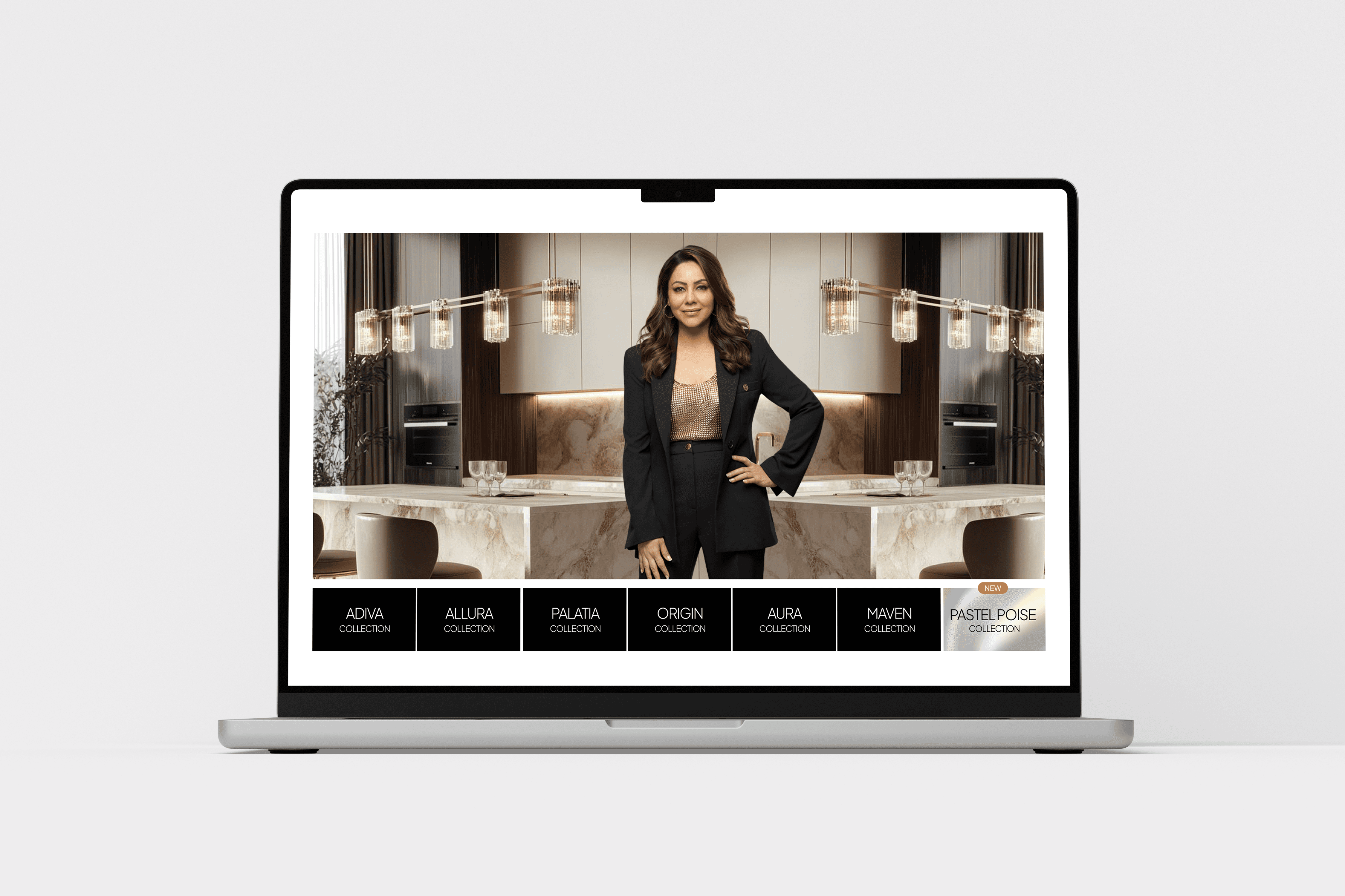
New Design of the Home Page
New Design of the Home Page
ABOUT US
ABOUT US
The About Us page is designed to build trust and show authenticity. It starts with a clear brand message and visuals to set a premium tone. The story and advantages are shown with text and real images to make the brand more transparent. Product benefits are displayed in a simple grid for easy reading. Showing the team members adds a personal and human touch. Overall, the page mixes brand values, product details, and people to connect better with users.
The About Us page is designed to build trust and show authenticity. It starts with a clear brand message and visuals to set a premium tone. The story and advantages are shown with text and real images to make the brand more transparent.
Product benefits are displayed in a simple grid for easy reading. Showing the team members adds a personal and human touch.
Overall, the page mixes brand values, product details, and people to connect better with users.
PRODUCT PAGE
PRODUCT PAGE
The product page was designed to highlight each quartz collection in a clear and engaging way. I focused on showcasing the product with lifestyle images to help users visualize it in real spaces. Specifications were placed neatly for quick reference, while features and moodboards were added to make the page informative and inspiring. Related collections were included at the bottom to keep users exploring and improve navigation.
The product page was designed to highlight each quartz collection in a clear and engaging way. I focused on showcasing the product with lifestyle images to help users visualize it in real spaces. Specifications were placed neatly for quick reference, while features and moodboards were added to make the page informative and inspiring. Related collections were included at the bottom to keep users exploring and improve navigation.
BLOG PAGE
BLOG PAGE
The blog page was designed to give Specta a space to share stories, design inspirations, and updates in a clean and easy-to-read format. The layout focuses on visuals and short previews of articles so that users can quickly scan and choose what interests them. To create better visual hi erarchy, I separated the two latest articles from the rest so they get noticed first. This also allows the client to highlight specific articles if they want.
The blog page was designed to give Specta a space to share stories, design inspirations, and updates in a clean and easy-to-read format. The layout focuses on visuals and short previews of articles so that users can quickly scan and choose what interests them. To create better visual hi erarchy, I separated the two latest articles from the rest so they get noticed first. This also allows the client to highlight specific articles if they want.
CAMPAIGN PAGES
CAMPAIGN PAGES
The campaign page was designed to display events in a simple grid layout so users can easily explore them. To avoid a monotonous look, I added the Specta slab in the center, which breaks the uniformity and brings a creative balance to the design. Each event also has a date along with its name, helping users quickly find and read events based on when they happened. This makes the page both functional and visually engaging.
The campaign page was designed to display events in a simple grid layout so users can easily explore them. To avoid a monotonous look, I added the Specta slab in the center, which breaks the uniformity and brings a creative balance to the design. Each event also has a date along with its name, helping users quickly find and read events based on when they happened. This makes the page both functional and visually engaging.

All Campagins Screen
Single Campaign Screen
CART PAGE
CART PAGE
CHECKOUT PAGE

New Design of the Home Page

CHECKOUT PAGE
CHECKOUT PAGE

CONTACT US PAGE
CONTACT US PAGE
Contact Us page
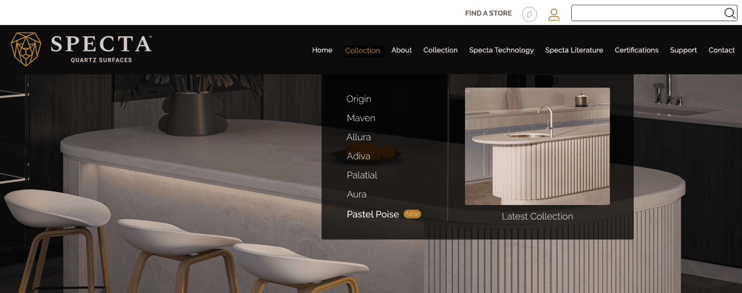
OVERLAY NAVIGATION MENU
OVERLAY NAVIGATION MENU
Fixed-width flyout menu with transparent overlay and hover image preview.

Full-width dropdown overlay with edge-to-edge layout and hover previews.
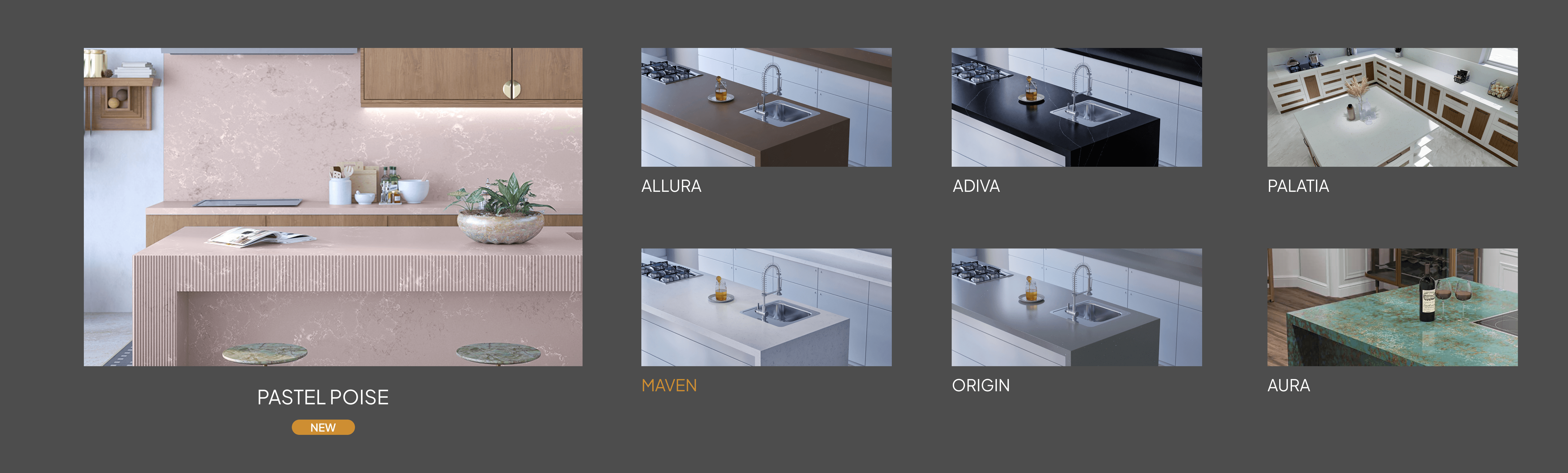
Grid-based mega menu with visual cards for quick browsing.
Grid-based mega menu with visual cards for quick browsing.
The design was approved by the client and is currently in development.
View Full Internship Document
View Full Internship Document